WeShop is a social shopping platform which allows users (both sells and buyers) to earn points by posting products by tagging the post with products from supported retailers.
CHALLENGE 1:
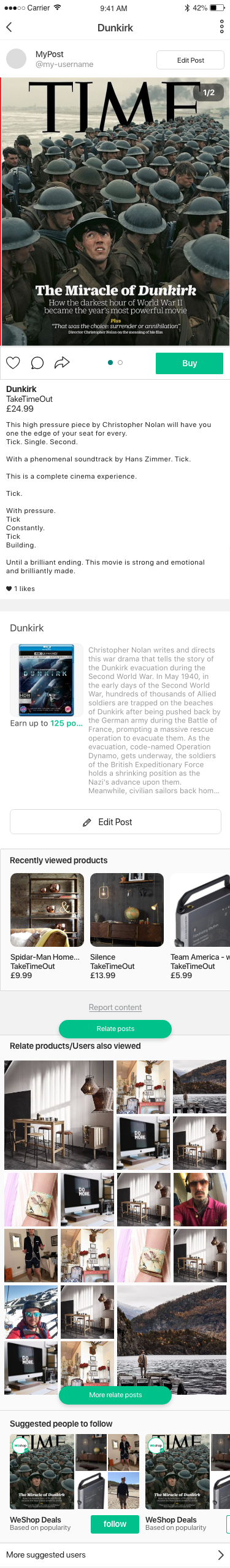
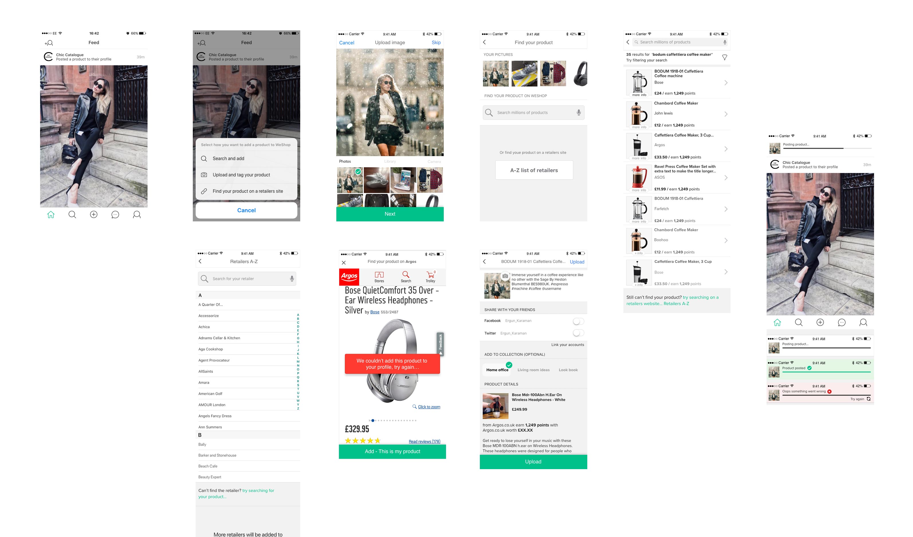
We found that the users were using the store product default images rather then uploading their own image because its easier and quick to do so. So the first challenge was a no brainer, how do we generate more unique UGC (user generated content) on the iOS app. One of the obstacles is that not all retailers are supported on WeShop and how do we implement the new add flow without making it difficult or unpleasant for the user. First step was to implement a test which tests 3 different ways to upload content/posts. Looking at which is version achieves the goal faster, which generates the most UGC and bounce rates. Looking at which is version achieves the goal faster, which generates the most UGC and bounce rates.
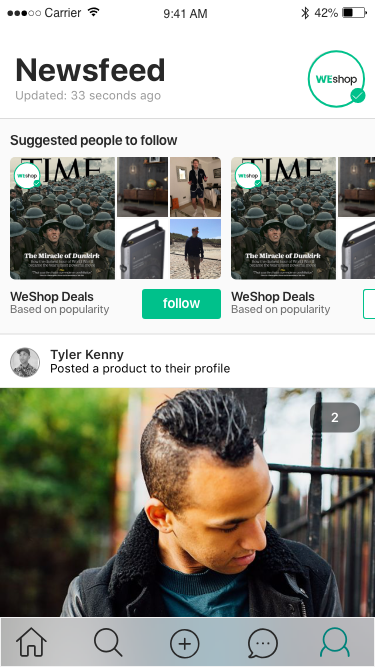
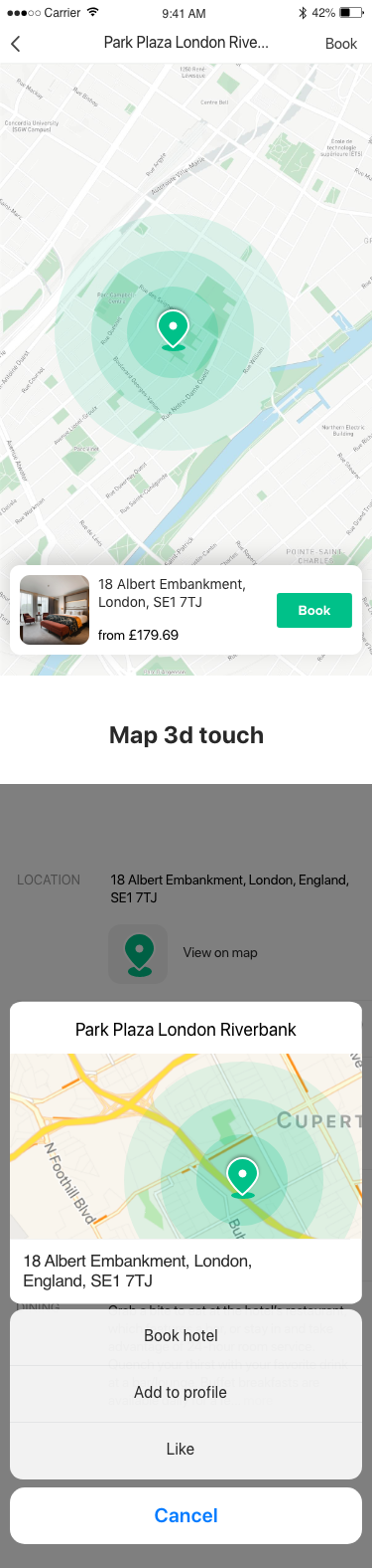
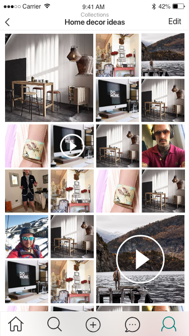
As we had the MVP in place it was time to introduce small features from suggested users, finding the latest posts, saved and liked posts, creating collections to 3D map touch.
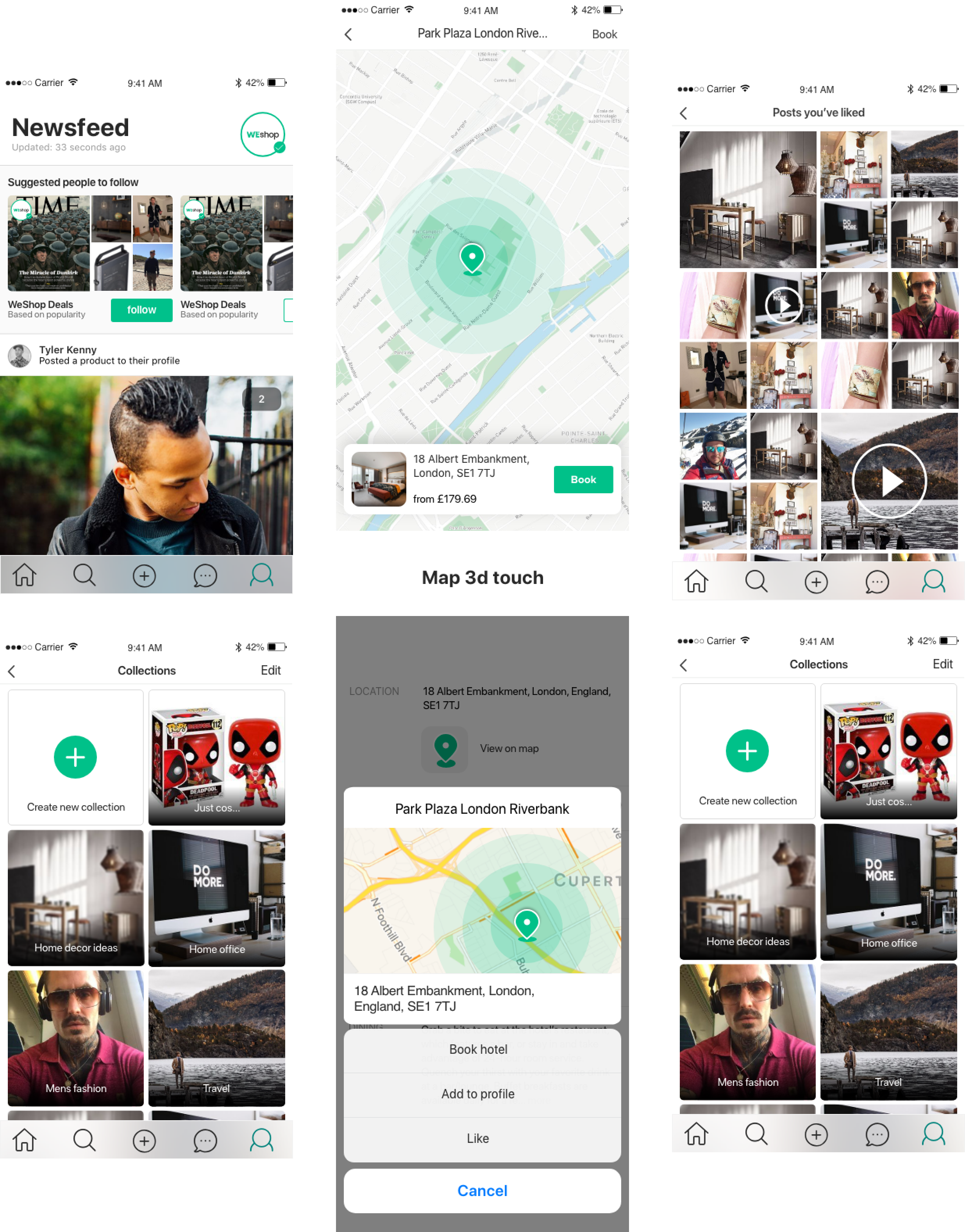
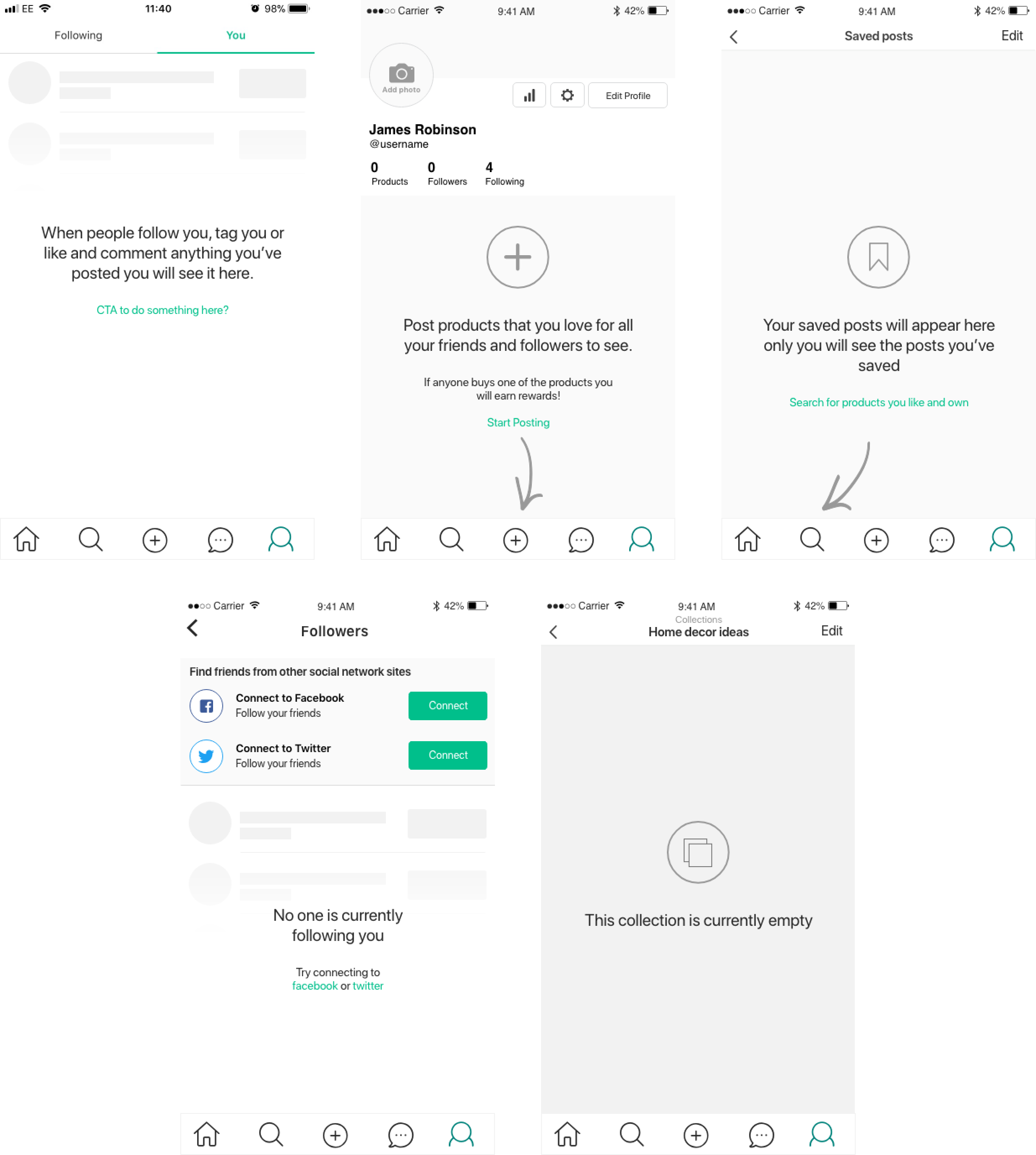
We also paid little attention to the empty states as it gives us a great opportunity to educate the user on what to do and how to do it.